Wednesday, 23 March 2016

Final Major Project - Sizing and Scaling


Final Major Project - Sizing and Scaling


Now I had the ledge finished, I needed to import everything and start getting the correct sizing and scaling. Luckily, Chris gave me a model template of a 6ft man. So I could use this to reference the size of my building and make sure everything is correct and proportionate.


This is the original size and scale which is completely wrong and needs to be re-sized. Before I resize and scale everything down I needed to alter the grid size so this building works in Unreal Engine.

Here are the default grid options.


Here are the correct grid options. I was unsure so Chris helped me out here massively.


Finally I needed to gain the correct size and scale. I research the average size of a floor on a two story building block. It turned out to be 10ft on average. So I allocated enough spacing (height-wise) for two floors and a ground floor that are proportionate to the 6ft model.


Final Major Project - Starting the 3D Model (Ledge)


Final Major Project - Starting the 3D Model (Ledge)


Now I have made my mind up on the building I wished to model, I moved straight onto Maya. Firstly, I started off with a basic rectangle that replicates the shape of the building which was fairly easy and simple. From here I needed to model the ledge. Here was the process.


From here I created three evenly space edge loops by going selecting Multiple Edge Loops > Edge Multiplier > 3. This gave me the appropriate amount of edge loops needed.


From here I selected and intruded the two centre edge loops and dragged them inward.

Here is the ledge with the two centre edge loops selected.


Here is the ledge with the two centre edge loops selected and dragged/inverted in.

From here I added more edge loops/multi-cuts around the edges to create a bevel or edge so that when I smooth it over for a more realistic effect it doesn't overly smooth it and ruin the ledge.


Here is the finished and smoothed over ledge.


Here is a comparison of the smoothed over effect with and without the multi-cut loops around the edge of the ledge. You can see how drastic the difference is.


From here I'll then import this into the main building and size everything up correctly.

Final Major Project - Deciding the Model and Preparing


Final Major Project - Deciding the Model and Preparing


Now I had my final concept piece finished, I needed to decide what I was going to model. After reviewing my entire piece I deicide on the second building on the left. It visually is the most appealing and detailed so it only makes sense to do so. However, I would face some challenges.

Challenges

  • No full orthographic (front-view only)
  • Lack of detail (Art style has limited the definition)
  • Creative Imitative (I'll have to model parts that do not exist already)
  • Textures (There are no set textures, so I'll have to add those later too)

Here is a screenshot of the building I will attempt to model...


The next stage will be to start the basic outline of this building in Maya.

Final Major Project - Exhibition Plan


Final Major Project - Exhibition Plan 


As part of our final we have to put on a exhibition show. Shiam and Chris wanted to see our thoughts on how we would lay the room out and what would go where. Then collectively make a decision.

Here is my exhibition plan...


Final Major Project - Peer (Blog) Assessment Sheets


Final Major Project - Peer (Blog) Assessment Sheets


Similarly to before, we had feedback sheets our peers would fill in based on our work. In this case, our blogs. We were told what was good and what we could improve on. Mine was very basic and only had two points. One thing I needed to improve on was the length of my writing/work.

I can agree. I need to make sure that in future I keep my work concise and to the point. 

Here is my feedback/critique sheet...


Tuesday, 22 March 2016

Final Major Project - Finishing Touches, Additional Masking and Finished Concept


Final Major Project - Finishing Touches, Additional Masking and Finished Concept


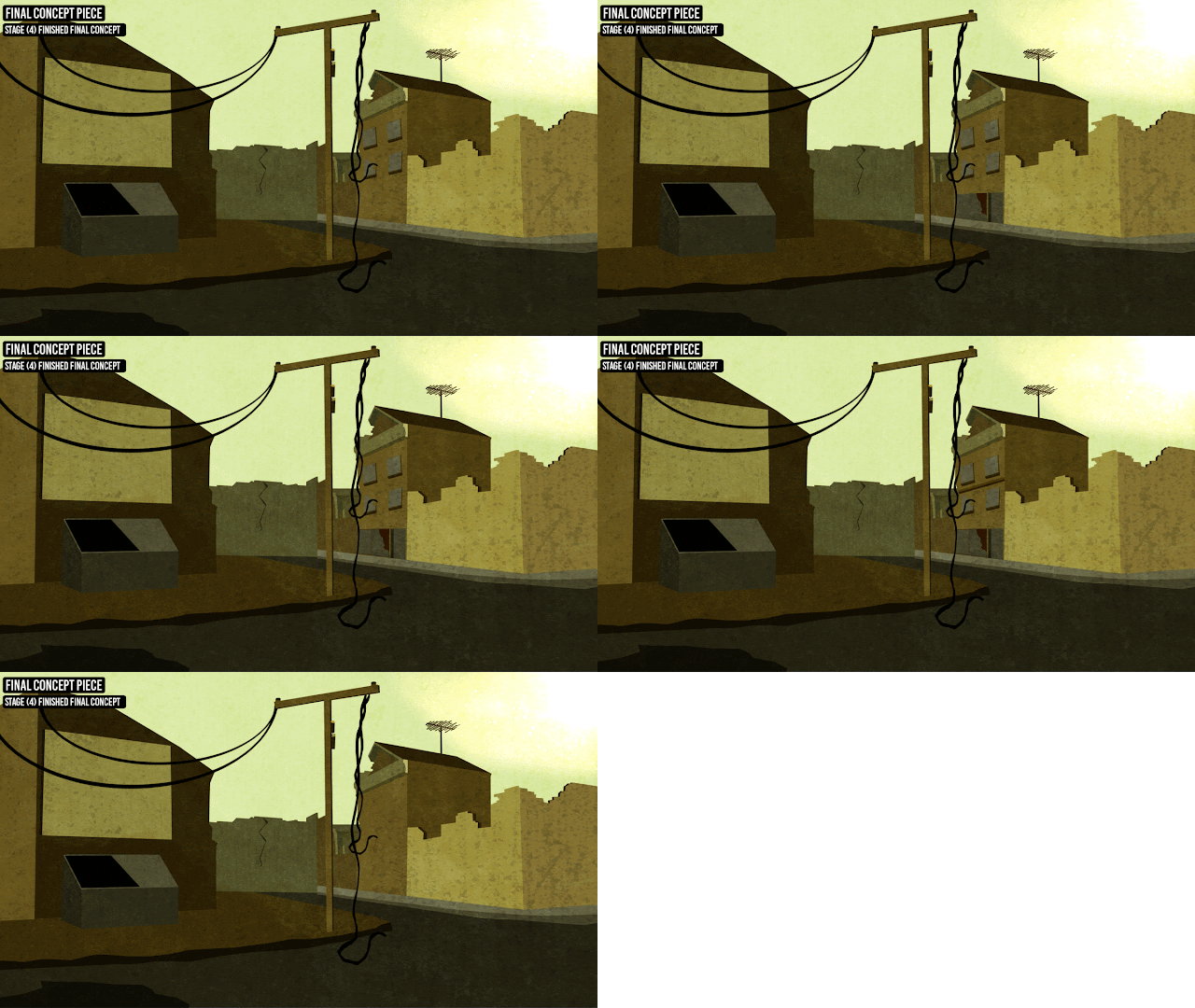
As much as I was pleased with the outcome of my final concept I knew there was something that felt 'off' or something that was missing. One thing after reviewing was the lack of detail. As much as I knew I would want this basic and minimalistic there needed to be a little more detail. More so if I was going to model, so I added more detail. I did this because I had detail but needed much more.

Here was the building I chose to add detail on before-hand.


I chose this building since it has the most base detail simply from pure masking. So, I needed to add ledges, windows and some form of door or access point to the building. 

Here is a progression (gif) of the design process in adding those details...


By this stage now, I am more than pleased with the outcome of my final piece. I feel I have managed to not only keep a consistent art style and theme. Not only this but I have also kept that minimalistic feel whilst still keeping enough detail and artistic elements/components.

Here is a final screenshot of my final concept piece, fully completed.


Here is a progression (gif) of the entire design process (layered) from start to finish...


Final Major Project - Texturing and Overlays


Final Major Project - Texturing and Overlays


The final stages I follow are post effects, textures and overlays. Before I add any final masking and additional details I always texture and overlay, since that has been my workflow for this entire FMP. Here I tried to keep it minimal and basic, so I only kept a palette of three textures.

They consisted of grunge, dust motes and rust. Here are the palette of textures I used...


Of course I had to tailor and change the settings so they weren't as drastic and harsh on the eyes as you see here. So, what I did was free transform (tool) them to the size of the canvas and then move onto the blend options and blend mode settings.

Here are the blend modes and opacity settings I set each of these texture overlays to...


Since I am keeping that minimalistic feel to my artwork I wasn't using area-specific textures. What I mean by this is I didn't use brick textures for walls even though it is a brick-wall. This could be something I really let show when I come to model if I have time to.

The dust particles were far to saturated and bright, so here are the settings after I changed them...


Finally here is a progression (gif) of each layer being added onto step by step...


Finally, here is the final piece with all added textures and effects...


The next and final step to completing the final concept piece and moving forward to modelling an asset would be to review and decide if anything needs to be changed or added.

Final Major Project - Recolouring and Lighting Alteration


Final Major Project - Recolouring and Lighting Alteration


Before I finish up this concept piece and finalize everything in the piece I needed to alter the colour of the piece. I felt as though it was too bright, therefore I altered the darkness of the piece through use of colour overlays, curves and brightness effects/filters.

Here is the recoloured version of the final concept piece.


This really does embody the look and feel of what I wanted. I wanted this, desolate, murky and ruined village since that shows some sign of abandonment and neglect but I have tried to keep true to not only my art style but also the back story. So I was very determined to keep this basic and simple.

Here is the comparison of the original and then the recolour...


I went through some small, minor alterations to get this result, most of which were basic colour changes and filters. I added a colour overlay, which I then changed through layer settings and then finally I altered the curve and brightness settings. Below are screenshots of these settings.

I used a murky brown to darken the overall piece. The colour code was #55501C.


Although I chose a dark brown to offset the piece, it was still far too light. Only way of changing this was too alter the curve settings and change the negative correlating point towards the black. This ultimately gave me that 'dingy and grungy' look to the entire piece.


I changed the layer blend mode to soft light since the murky brown was an overlaying colour it completely covered the piece and nothing of the masking and previous work was visible. Soft light dropped the opacity enough to make all underlying layers visible so much so I didn't need to alter the opacity what so ever. Having that said, as you can see, I left the opacity at 100%.

Below is a progression screenshot of the process I went through...


Monday, 21 March 2016

Final Major Project - Additional Masking and Detailing


Final Major Project - Additional Masking and Detailing


So with the basics done and finished I figured before I move onto overlaying effects, particles and textures I needed to finalize and add any further details I wanted, now. I knew that this was far too basic and bare bone for me to start finishing up and adding final details.

So, I started off adding some both minor and major details.

Here are some of the following...


Here is a comparison between the changes I have made here from the basic outline from before.


I now had a telephone pole added, as part of a telephone pole there needs to be cables and wires linking and connecting from house to house. So, here is the final result of the telephone pole with the added cables on the left hand side of the concept piece.


Here is the method and process I went through in order to achieve this look.


Here is the telephone pole with the added cables and wires.


After adding the cables and wires I wanted to add a dumpster on the left hand side of the piece since there was such a wide, open space. Not only this but it was one of the main assets I referred too during my research phase. So, I went ahead and masked a basic dumpster. Here it is...


As much as this blue-ish kind of colour is massively similar too that of real life dumpsters I knew I didn't like this and it felt overly saturated from the colour palette I currently have, so I changed it.

Here is the re-coloured dumpster I did...


Here are the hue, saturation and brightness settings for the altered colour settings...


Final Major Project - Final Concept Piece (Basic Masking)


Final Major Project - Final Concept Piece (Basic Masking)


I decided that I had all the tools, resources and practice to start my final piece. I needed to ensure I was following each step of my research and feedback to get the best result possible. The first step I did was layout a base colour for the sky/background. I refereed back to my colour palette for referencing in colour. After some thought and experimentation, I chose colour-code #E1F5C.

This is the background layer and 'sky' for the setting of the environment. I chose this murky, Kelly greenish colour for the sky. Reason being is because this gives off an almost radiated daytime look. Once I add effects, filters and overlays I should have an ideal sky for the setting. 


From here I started looking at reference pictures from my research in games and saw a lot of broken walls, brickwork, paving and roads. So, what I did was began to mask and outline some of these in my own work and preference. From here I would move onto building structure and housing.


I wasn't entirely sure on the colour of the road. It felt drastically dark. I knew I needed to change this,

Here are the comparisons of the roads. I didn't want such a dark and dingy grey for the road. As much as I want a dark, grungy feel since it is a post apocalyptic setting, I do feel it needed to be lighter. What I did was take note of the current/original colour code and shift the colours so it is lighter.

Here are the colour code settings (before and after).

Here I moved onto the buildings and surrounding housing. Again it is simple, basic masking. Nothing new or original. Here at this point I am just trying to get basic definitions down.

At the moment I am at impartial feeling with the colour scheme. I have heavily relied on the colour palette reference I created earlier. I am trying to keep the original colour scheme I set out originally but have drifted off and started to refer to my newer colour palette. Which is what was recommended.

There are a few aspects of this that I might tailor and change later on, but for now, it looks fine. 

If there is any time I will change them, it will be once everything is masked and the layout is finished.


The screenshot above is the fully masked layout. This is going to be the foundation of my final concept and what I build the entire environment piece around. However, from here I will begin to review and look over the piece and make the changes I feel are needed and necessary. 


Above is the progression (gif) of the entire process (layered) of the basic outline in my final concept.


Sunday, 20 March 2016

Final Major Project - Camera Angles/Perspectives


Final Major Project - Camera Angles/Perspectives


A major element to the appearance of the final concept is the angle in which I compose the final concept. I need to ensure that I capture the right look, as well as capturing the right feel/atmosphere. The angle in which I do this contributes to this factor, massively. I drafted down some various angles from game concepts already and think about which and why before moving onward.


Wednesday, 16 March 2016

Final Major Project - Texture Palettes


Final Major Project - Texture Palettes


Another main point made throughout my peer assessment was detailing. I lacked detailing and one of my peers made a point that I should add more textures and look at some varying textures in specific areas or types (brick, metal, glass etc). So, I went ahead and did so. I made a design sheet that covers some of the main textures I would typically include in my developed and soon, final concept.

Here are the following texture palettes...


My next stage is to take all of this research and from here move onward to the final concept. I may need to do one more developed concept which is a practice run of seeing how well I can achieve the look I am after but also meeting the criteria and feedback set by my peers.


Tuesday, 15 March 2016

Final Major Project - Colour Schemes and Palettes (Experimentation)


Final Major Project - Colour Schemes and Palettes (Experimentation)


One of the main points of criticism that was made throughout my peer assessment points was that the developed concepts were lacking in colour or varying colour. So, a way to fully understand the best I could of minimalistic colours for this particular art style was to look, list and colour code minimalistic colours. All I am trying to do here is to is fully extend my artistic knowledge especially with the colour palettes as they were the colours choices I made were highly criticized.

Here is the colour palette list I came up with.


What I tried to do was explore a variety of warm, neutral and cool colour palettes. I didn't want to restrict to a specific colour palette. Since any of these colours could be used towards an asset I felt it was important to list each kind of colour palette. I also took note of the HTML colour codes for ease.


Monday, 14 March 2016

Final Major Project - Peer Assessments


Final Major Project - Peer Assessment


First Peer Assessment

As part of furthering our personal development we did peer assessment sheets for one and other where we gave both a positive and a criticism on their current work. The part of this is to aid those who have either a creative/mental block and need a outsiders eyes, or generally to help the design process. I received some much needed criticism for my developed concept work. 

The main points were as followed...

  • Add more details to the surrounding buildings. They felt very bland and basic. I highly agree with this point since they do feel generally... basic. However, I did state in the breaking paragraph how for these developed concepts I didn't want to idle hence the lack of detail.
  • Changing the colour-scheme. I agree again with this point. Although I am looking to keep the colours akin to the post apocalyptic and war-torn city vibe/feel. But I also need to make sure that the colours don't clash and give off this mix and match feel to them. As so far, they have.


For the future and final piece is work on the colour-scheme and definitely more detail. I will have to work on some more design sheets putting this into practice before I start on the final. I can ask for criticism on these once they are done. Possibly comparing and contrasting these with the old work.

Second Peer Assessment

We repeated the same process except this time we had an entirely different group critique our work. Here are the following points and criticisms made about my work. This sheets criticisms were very close to that of the first sheet. Generally hinting that I work on the colour scheme and detailing.