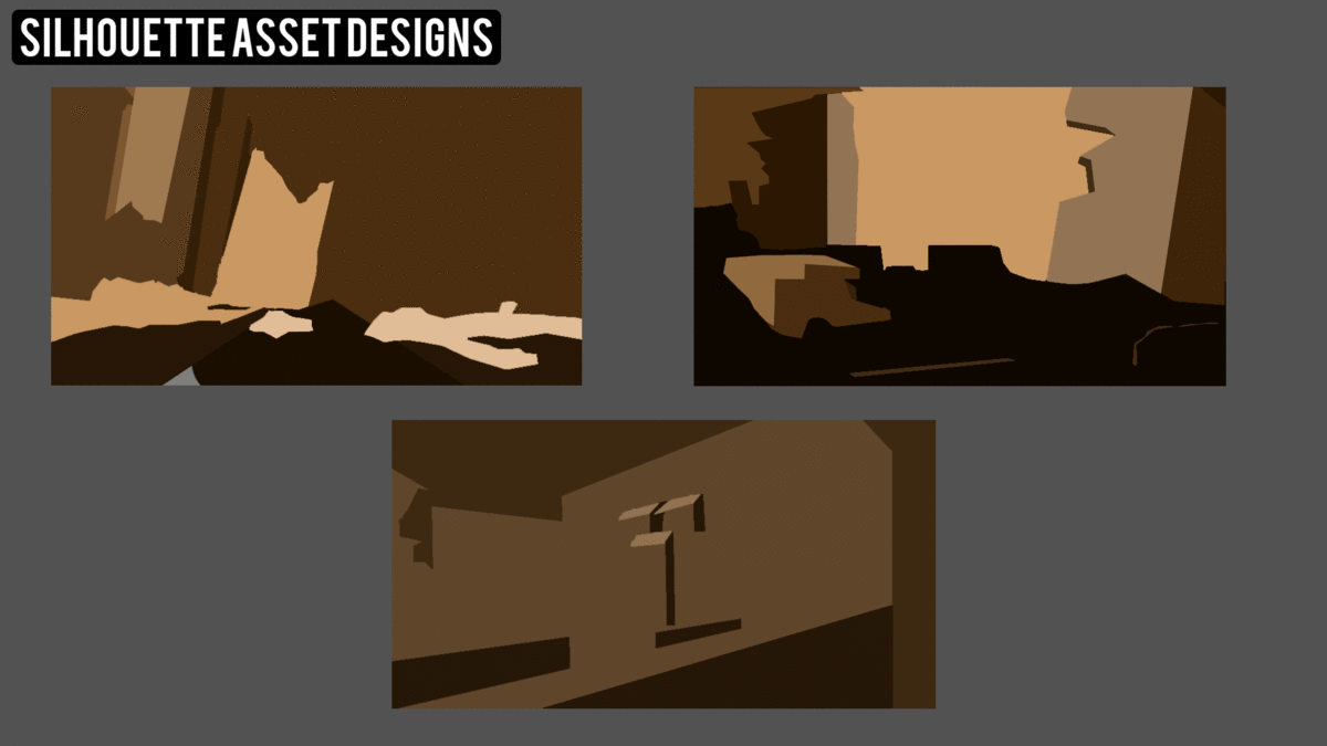
Final Major Project - Backstory (How Will This Affect My Design?)
In order to create as realistic and unique of a environment that is based around such an overused theme (post apocalyptic), I needed to define how the world my became the way that it is. This is not only an important point I needed to take into consideration but also a recommendation from Chris as a method of 'putting my own stamp' on this idea, project and of course, artwork.
Of course how the world became post apocalyptic can determine how the environment looks/feels. A world that is brought to a post apocalyptic state by nuclear warfare is going to look and feel vastly different of that a world brought to that state from an epidemic of some degree.
Of course how the world became post apocalyptic can determine how the environment looks/feels. A world that is brought to a post apocalyptic state by nuclear warfare is going to look and feel vastly different of that a world brought to that state from an epidemic of some degree.
The Backstory
The idea is set and based around central USA (no specific city/state) in the early 2000's. This is during the same time period as the current oil crisis. Mankind has began to crumble and any means of society or civilization is gone and people are fighting for fluids and or water. The oil crisis had caused major oil spills in the water supplies to houses, districts, office blocks, public utilities etc and then the city has had to make a choice of either poison yourself to death from drinking this oil-ridden water, or dehydrate. A select few have manage to sustain themselves and in the early stages of this crisis the city has been engulfed in chaos. Democracy and any form of policy or policing is gone.
People scavenge, fight and kill for any means of fluid to survive. The world around them has crumbled. Buses are turned over, cars, homes and buildings alike have been abandoned so much and for so long to the point where the city around them has become overgrown with flora. Camps, refugee camps and little groups of survivors that have sufficed on rainwater, bodily fluids and what small sources of liquid they can find still search for a renewable source of clean water to save themselves.
How Will This Affect My Design?
Having spoken with my group during a critique session I was recommended to think about how the story behind my artwork could affect the artwork itself. How would central USA look with flora, moss and various greenery covering more than half of every surface? Also with debris everywhere? What the the specific looks that this brings? These are the smaller details I need to consider.
- Flora and Greenery (moss, vines, overgrown dead grass and trees (roots surfacing).
- Debris and Rubble (cracked floors, blocks of concrete and brickwork, glass, bins, litter and rubbish)
- Vandalism (Graffiti or warning signs, broken cars, bins and dumpers broken, dented and busted, office complexes defaced, homes and gas stations dilapidated)
- Makeshift Assets (DIY/Makeshift beds, shacks, homes, huts, camps, fires in bins etc)


